
 Алгебра
 Английский
 Биология
 География
 Геометрия
 История
 Русский
 Обществознание
 Физика
 Химия
Химия Информатика
 Литература
 Математика
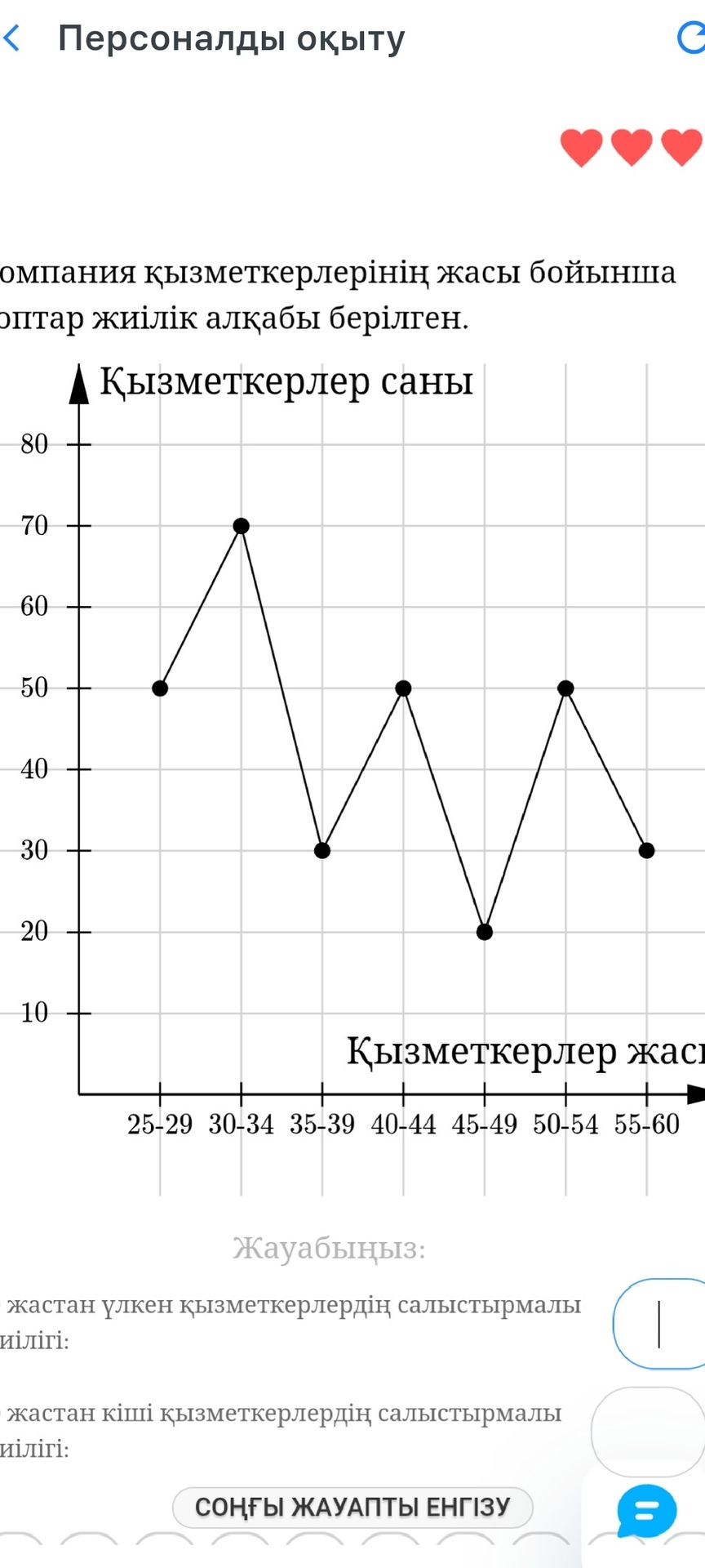
Analyze the provided line chart. The chart displays the number of employees based on their age groups. The question asks to compare the number of employees older than a certain age and younger than a certain age. However, the specific age for comparison is missing in the text provided in the image.
Ответ:
Analysis of the Line Chart:
The line chart shows the distribution of employees by age groups. The x-axis represents age ranges (e.g., 25-29, 30-34, etc.), and the y-axis represents the number of employees.
The provided text asks for a comparison of employees older and younger than a certain age. However, the specific age for this comparison is not stated in the visible portion of the image. Without this critical piece of information, it is impossible to provide a specific numerical answer or a definitive comparison.
To answer the questions, the age for comparison needs to be specified.
- If, for example, the comparison age was 40:
- Employees younger than 40: This would include age groups 25-29, 30-34, and 35-39. The approximate numbers are 50, 70, and 30, respectively. Total younger than 40 would be 50 + 70 + 30 = 150 employees.
- Employees older than 40: This would include age groups 40-44, 45-49, 50-54, and 55-60. The approximate numbers are 50, 20, 50, and 30, respectively. Total older than 40 would be 50 + 20 + 50 + 30 = 150 employees. - If, for example, the comparison age was 35:
- Employees younger than 35: Age groups 25-29 (50) and 30-34 (70). Total = 120 employees.
- Employees older than 35: Age groups 35-39 (30), 40-44 (50), 45-49 (20), 50-54 (50), 55-60 (30). Total = 180 employees.
Conclusion: The question cannot be answered without knowing the specific age for comparison. The data points from the chart are approximately: (25-29, 50), (30-34, 70), (35-39, 30), (40-44, 50), (45-49, 20), (50-54, 50), (55-60, 30).
