
 Алгебра
 Английский
 Биология
 География
 Геометрия
 История
 Русский
 Обществознание
 Физика
 Химия
Химия Информатика
 Литература
 Математика
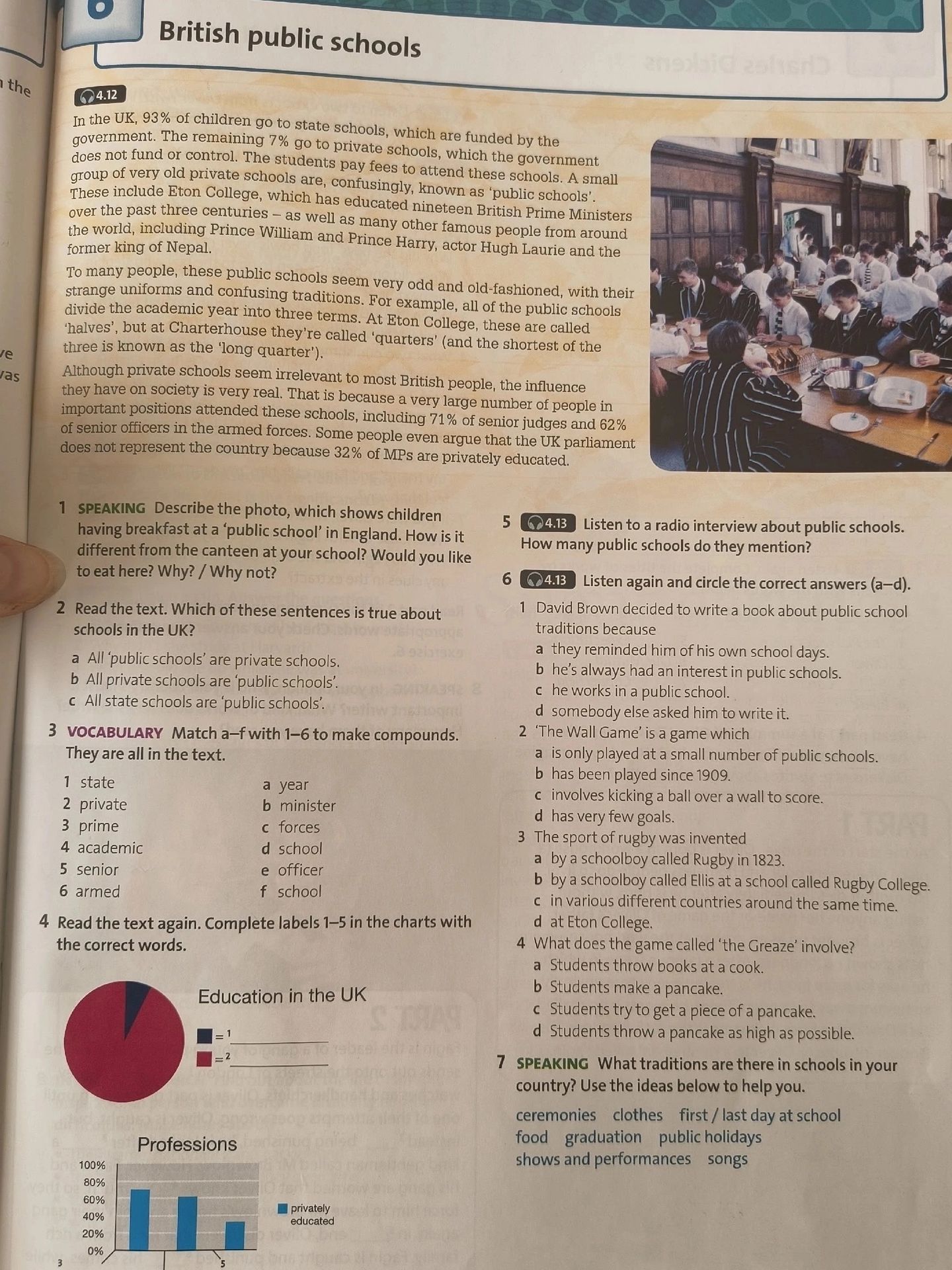
4 Read the text again. Complete labels 1-5 in the charts with the correct words.
Ответ:
Chart Completion:
The text provides information that can be used to complete the charts. The first chart is titled 'Education in the UK' and has a pie chart with a legend indicating '= 1' and '= 2'. The second chart is titled 'Professions' and is a bar chart showing percentages.
Analysis for 'Education in the UK' chart:
The text states: 'In the UK, 93% of children go to state schools... The remaining 7% go to private schools...'. This data directly corresponds to the pie chart, where the larger section (likely '= 1') represents state schools and the smaller section (likely '= 2') represents private schools.
Analysis for 'Professions' chart:
The text states: '...including 71% of senior judges and 62% of senior officers in the armed forces. Some people even argue that the UK parliament does not represent the country because 32% of MPs are privately educated.' These percentages relate to professions and private education.
The labels 1-5 are not explicitly shown in the image, but based on the context of typical charts and the information provided, here's how the labels would likely be filled:
Education in the UK chart:
- If '= 1' represents the majority and '= 2' represents the minority:
- 1: State schools (93%)
- 2: Private schools (7%)
Professions chart (assuming labels 3, 4, 5 correspond to professions and privately educated):
- The text mentions:
- 71% of senior judges
- 62% of senior officers in the armed forces
- 32% of MPs are privately educated
Without explicit labels 1-5 on the image, we can infer possible answers based on the text:
- Likely profession categories on the 'Professions' chart could be: 'Senior Judges', 'Senior Officers', 'MPs', and 'Privately Educated'.
- If the bars represent percentages of people in certain professions who are privately educated, or the percentage of privately educated people within those professions:
- 3: Senior judges (implied by 71%)
- 4: Senior officers (implied by 62%)
- 5: MPs (implied by 32% privately educated)
Note: The exact labels for 1-5 are not visible in the provided image, so this answer is based on interpreting the text and common chart formats.
Answer: 1: State schools, 2: Private schools, 3: Senior judges, 4: Senior officers, 5: MPs.
Похожие
- 1 SPEAKING Describe the photo, which shows children having breakfast at a ‘public school’ in England. How is it different from the canteen at your school? Would you like to eat here? Why? / Why not?
- 2 Read the text. Which of these sentences is true about schools in the UK?
- 3 VOCABULARY Match a-f with 1-6 to make compounds. They are all in the text.
- 5 4.13 Listen to a radio interview about public schools. How many public schools do they mention?
- 6 4.13 Listen again and circle the correct answers (a–d).
- 7 SPEAKING What traditions are there in schools in your country? Use the ideas below to help you. ceremonies clothes first / last day at school food graduation public holidays shows and performances songs
